The 2014 National Climate Assessment is an authoritative summary of climate impacts in the United States. Below are key indicators from the report. Click the headline or the image to go directly to the interactive version of the infographic.
Observed U.S. Temperature Change:
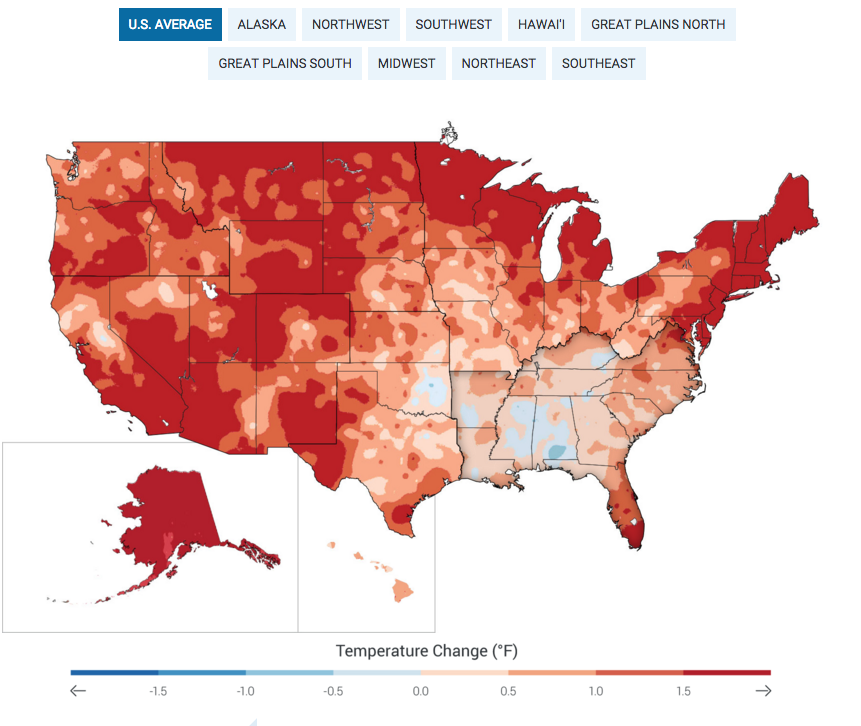
- Figure 2.7: The colors on the map show temperature changes over the past 22 years (1991-2012) compared to the 1901-1960 average, and compared to the 1951-1980 average for Alaska and Hawai‘i. The bars on the graphs show the average temperature changes by decade for 1901-2012 (relative to the 1901-1960 average) for each region. The far right bar in each graph (2000s decade) includes 2011 and 2012. The period from 2001 to 2012 was warmer than any previous decade in every region. (Figure source: NOAA NCDC / CICS-NC).
Projected Temperature Change (US):
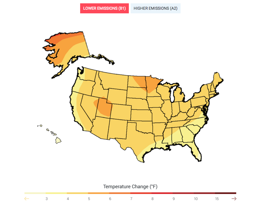
- Figure 2.8: Maps show projected change in average surface air temperature in the later part of this century (2071-2099) relative to the later part of the last century (1970-1999) under a scenario that assumes substantial reductions in heat trapping gases (B1) and a higher emissions scenario that assumes continued increases in global emissions (A2). (See Appendix 3: Climate Science, Supplemental Message 5 for a discussion of temperature changes under a wider range of future scenarios for various periods of this century). (Figure source: NOAA NCDC / CICS-NC).
Projected Change in Average Annual Temperature (global):
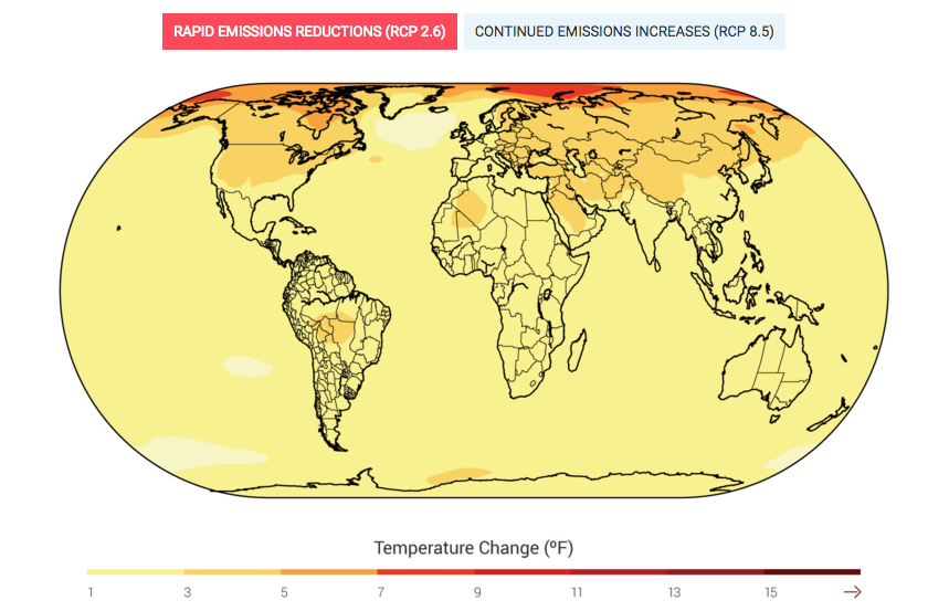
- Figure 2.5: Projected change in average annual temperature over the period 2071-2099 (compared to the period 1970-1999) under a low scenario that assumes rapid reductions in emissions and concentrations of heat-trapping gases (RCP 2.6), and a higher scenario that assumes continued increases in emissions (RCP 8.5). (Figure source: NOAA NCDC / CICS-NC).
Projected Change in Average Annual Precipitation (global):
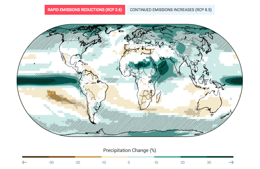
- Figure 2.6: Projected change in average annual precipitation over the period 2071-2099 (compared to the period 1970-1999) under a low scenario that assumes rapid reductions in emissions and concentrations of heat-trapping gasses (RCP 2.6), and a higher scenario that assumes continued increases in emissions (RCP 8.5). Hatched areas indicate confidence that the projected changes are significant and consistent among models. White areas indicate that the changes are not projected to be larger than could be expected from natural variability. In general, northern parts of the U.S. (especially the Northeast and Alaska) are projected to receive more precipitation, while southern parts (especially the Southwest) are projected to receive less. (Figure source: NOAA NCDC / CICS-NC).
Very heavy precipitation (US):
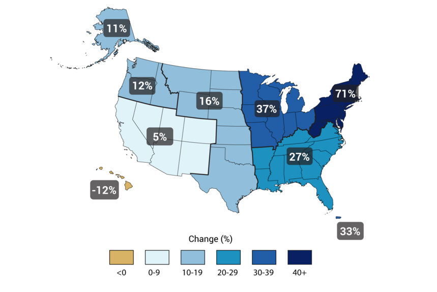
- Figure: Observed Change in Very Heavy PrecipitationCaption: The map shows percent increases in the amount of precipitation falling in very heavy events (defined as the heaviest 1% of all daily events) from 1958 to 2012 for each region of the continental United States. These trends are larger than natural variations for the Northeast, Midwest, Puerto Rico, Southeast, Great Plains, and Alaska. The trends are not larger than natural variations for the Southwest, Hawai‘i, and the Northwest. The changes shown in this figure are calculated from the beginning and end points of the trends for 1958 to 2012. (Figure source: updated from Karl et al. 20091).
Source: National Climate Assessment